View Accessible Content Core Skills (PDF version)
What is Accessible Content?
When content and information is more accessible, everyone benefits. Accessible content is information that can be read, scanned and/or listened to by people with disabilities. Visual and non-visual users (such as people who use screen reader software) must be able to access content in a meaningful way. This requires an attitudinal shift since we are used to creating content with only visual users in mind.
More Accessible (not Fully Accessible)
It can be very hard to make content fully accessible because we have such diverse needs. But there are skills and strategies for creating content that is more accessible to people with and without disabilities. Content that is more accessible will also be more clear and concise for all students, staff and the wider community of York Region District School Board (YRDSB or the Board).
Core Skills for Creating Accessible Content
There are seven core skills to creating accessible content, as adapted from the University of Minnesota’s Accessible U. These core skills focus on digital accessibility because we all use digital technology (such as computers, laptops, tablets and smart phones) to work and learn. This resources will offer accessibility best practices and guidelines as well as practices to avoid for each accessible content core skill:
-
Layout -Accessible Content Core Skill 1 (PDF version)
-
Headings -Accessible Content Core Skill 2 (PDF version)
-
Colour Contrast -Accessible Content Core Skill 3 (PDF version)
-
Links -Accessible Content Core Skill 4 (PDF version)
-
Alternative Text -Accessible Content Core Skill 5 (PDF version)
-
Tables -Accessible Content Core Skill 6 (PDF version)
-
Audio and Video -Accessible Content Core Skill 7 (PDF version)
The way we choose to present or lay out information is key to creating accessible content. We have to be intentional when choosing layout elements such as font, alignment, spacing and lists. Some layout and formatting choices still used today are based on old habits and practices that are not accessible. We need to move past these dated practices that continue to be systemic barriers to accessibility.
Font Type and Size
Font Type: Certain types of fonts are naturally more accessible to readers – these are called sans-serif fonts. These fonts have even letter thickness and do not have decorative endings (known as serifs) on each letter.

Did you know? Text larger than size 18 (or size 14 with bold) can meet accessibility requirements with lower contrast ratios.
Font Size: When it comes to font size, bigger is always better. Larger fonts have higher resolution, reduce the need for users to zoom in or enlarge text, and are all around easier to read.
Alignment and Spacing
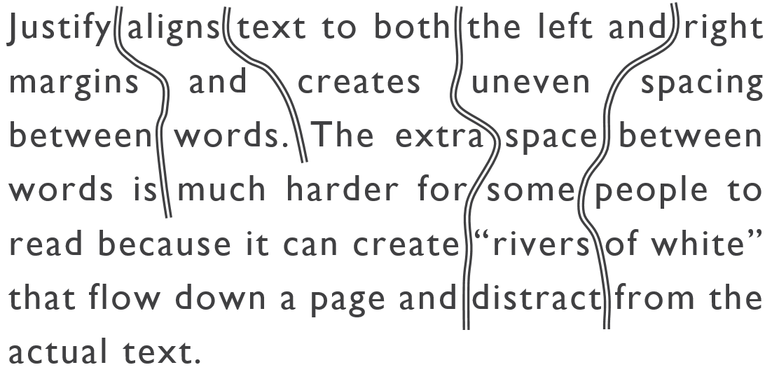
Alignment: Text should always be aligned to the left margin to keep even spacing between words. Justify aligns text to both the left and right margins and creates uneven spacing between words. The extra space between words is much harder for some people to read because it can create “rivers of white” that flow down a page and distract from the actual text (see example below).
Spacing: The spacing between lines of text is just as important as the alignment and spacing between words. Some people have trouble tracking lines of text if they are too close together (see example below).
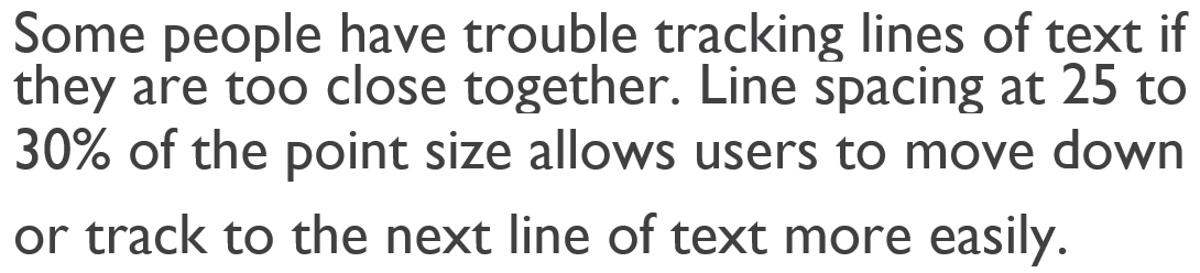
Line spacing at 25 to 30% of the point size allows users to move down or track to the next line of text more easily. However, the default line spacing is set to less than 25% in word processor software like Microsoft Word and Google Docs.
Did you know? You only need one space after a period, question mark or exclamation point. The use of two spaces to begin a new sentence is a dated practice that adds unnecessary spacing to a document.
The built-in paragraph or line spacing tools in these programs allow you to create both visual and non-visual space. Using the space bar, ‘Tab’ or ‘Enter’ key repeatedly only creates visual space, and is not accessible to people who use screen readers. Every extra line or ‘enter’ will be read as the word “blank” with screen reader software.
Lists
Using nugget or number lists are an effective way of presenting information so it is easier to process and understand. We are more likely to read content presented in lists than in long paragraphs that we see as “walls of text”. Lists help to break up text into smaller parts or chunks of information. Chunking is the preferred way of reading and scanning information, especially for reading online.
The practice of writing long paragraphs (often learned for essay writing) is not recommended for creating accessible content. Instead, use lists to present key concepts, ideas, steps or procedures. Short paragraphs can also be used (just avoid long paragraphs).
To create accessible lists:
- Use the built-in nugget or number lists available in different programs or website builders;
- Use the standard nuggets that come up automatically (custom nuggets may not be accessible to screen reader software);
- Add appropriate spacing between list items (just like between lines of text); and
-
Try to split longer lists into separate smaller lists with headings if possible (a long list that takes up a whole page may still look like a “wall of text”).
Do (Best Practices):
- Use a consistent sans-serif font with clear upper and lower case letters (e.g. Arial, Gill Sans, Verdana).
- Keep text above a 12-point font size and use larger font sizes for headings.
- Use bold to emphasize text.
- Align text to the left margin to keep even spacing between words.
- Ensure appropriate spacing between lines of text (25-30% of the point size).
- Use built-in paragraph or line spacing tools to create both visual and non-visual space.
- Start a new sentence with only one space.
- Use nugget or number lists (and short paragraphs) to chunk information.
Don't (Dated Practices):
- Don't use serif fonts like Times New Roman or different fonts throughout a document or web page.
- Don't use font sizes below 11.
- Don't use all capital letters, italics or underline (hyperlinks excluded) for emphasis.
- Don't justify text alignment as it causes uneven spacing between words.
- Don't use single-spacing between lines of text or default line spacing settings.
- Don't use the ‘space’ bar or ‘enter’ key repeatedly to create visual space.
- Don't use two spaces to begin a new sentence.
- Don't have long paragraphs or “walls of text” in a document or web page.
Accessible Content Core Skill 2 (PDF version)
Headings are the most effective way to create structure and order to web content and digital documents. The proper use of headings allows visual and non-visual users (i.e., people who use screen reader software) to scan and navigate content much more easily.
Styles
The best practice for adding or customizing headings for any written content is by using the preset ‘styles’ tool. Style headings should be used as the basis for structuring all documents, web pages and even emails.

Styles also allow you to format and change the font size, colour and spacing of your headings and body text all at once. You can format whole documents much more quickly by applying headings the right way.
Do:
- Use headings! Use styles to add headings and format your content for accessibility.
- Keep heading levels in order (e.g., Heading 1, Heading 2, Heading 3, etc.).
- If needed, insert a table of contents automatically based on your document headings.
Don't:
- individually reformat the font size and style of text to create headings – these manual headings will not be accessible to screen reader users.
- use the default “Title” or “Subtitle” style options in Google Docs or Microsoft Word.
Accessible Content Core Skill 1 (PDF version)
Strong contrast ratios between the colour of your text and background are very important for accessibility. Black and white give us the best possible contrast ratio of brightness to darkness (21:1). The Board’s All Access Washroom signs are an example of high contrast (with Braille) as a best practice.

Colour can still be an effective way to show visual information, but it should be used in moderation. Consider the following tips when using colour to show, emphasize or differentiate information.
Do…
- Use a free online contrast checker to test the contrast ratios between colours.
- Make sure to use a second visual cue when using colour to show information. For example: complete, in progress, incomplete.
- Use larger font sizes when possible – text larger than size 18 (or size 14 bold) can have lower contrast ratios (refer to the ‘Layout’ core skill for more information on readable fonts).
Don’t…
- Don’t use too many colours or low contrast colours (refer to WCAG contrast minimum).
- Don’t use colour as the only way to show information.
Accessible Content Core Skill 3 (PDF version)
The proper use of links and hyperlinks can make it easier for people to access content. Links are one of the most important parts of web accessibility because it is how people navigate through content. Links should be brief, descriptive, and meaningful even without context.
Brief and Descriptive
Link text, also known as anchor text, should be a word or short phrase that describes where the hyperlinks leads. There is no rule for the length of link text, but hyperlinking full sentences or multiple lines of text is often distracting. The best practice is to keep link text as short as possible without losing meaning.
Example of brief and descriptive link text:
“The YRDSB school reopening plans are available to the public on the Board website.”
Example of descriptive but not brief link text:
“The YRDSB school reopening plans are available to the public on the Board website.”
Example of brief but not descriptive link text:
“The YRDSB school reopening plans are available to the public on the Board website.”
Anchor text that is too vague may not make sense to users scanning from link to link. Visual users will often scan through content for useful links. Screen reader users have the similar ability to hear a list of all the links on a page. This is why nondescript phrases such as “click here” or “learn more” should be avoided as link text.
Web addresses as hyperlinks
In most cases, you should also avoid hyperlinking web addresses or URLs in web content. URLs are often long and may include a mix of numbers, letters and other characters that have no meaning to most people. A brief and descriptive hyperlink links to the same URL in a way that is easily readable.
Do…
- Use descriptive and informative words or short phrases as link text.
- Check regularly to ensure there are no broken links and that all hyperlinks lead to the intended location.
Don’t…
- Don’t use nondescript link text, like “click here” or “learn more”.
- Don’t hyperlink full sentences or multiple lines of text.
- Don’t include or hyperlink URLs or web addresses in web content.
Alternative text (alt text) is used to describe the essential information in images, tables, charts, diagrams and other graphics. Alt text allows people who use screen reader to understand images and other graphics. It is important to get in a habit of adding alt text to every image and graphic.
What you include as alt text depends on how you are using an image or graphic. Here are some different types of images with examples of appropriate alt text:
- Informative Images
- Functional Images
- Complex Images
- Decorative Images
Informative Images
Images or pictures that visually represent information should include alt text that describes the image as a whole. Here is an example using the YRDSB logo:


The standard alt text when using the YRDSB logo is: “Logo for York Region District School Board (YRDSB) in black and red”.
This alt text describes the image as a whole. You do not need to write out what the actual logo looks like or how the words are positioned within the logo.
Functional Images
Images that are used as links or buttons are known as functional images. They should include alt text that describes the function or action of the image.

This same image (above) of the YRDSB logo has different alt text as a functional image that hyperlinks to the YRDSB home page. The new alt text describes the function that the image performs: “York Region District School Board (YRDSB) home page”.
Complex Images
Charts, tables, diagrams and other informational graphics are complex images that need alt text. Include a brief description of the chart or graph as alt text, and then describe the chart or graph in more detail in another place (e.g., in the text before and/or after the chart or graph).
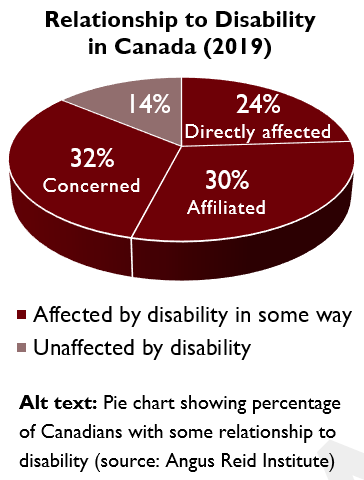
Here is an example of alt text with additional descriptive text of two comparative charts in the Multi-Year Accessibility Plan:
Descriptive text before charts: The wider impact of disability was examined in a 2019 study by the Angus Reid Institute in partnership with the Rick Hansen Foundation. The study found that 86% of Canadians are impacted by disability in some way – either directly affected (24%), affiliated through a family member or close friend with a disability (30%), or concerned (32%) about how disability will affect them in the next 5 to 10 years.
 '
'
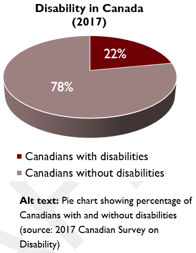
Descriptive text after charts: The 2019 data also highlights the importance of accessibility by showing how disability does not only impact people with disabilities, but affects almost everyone. Only 14% of Canadians believed that they have no relationship or concerns when it comes to disabilities issues based on findings from the 2019 Angus Reid Institute study. While recognizing that 22% of Canadians have a disability, it can be more impactful to also state that disability affects 86% of Canadians either directly or indirectly.
Decorative Images
Certain images or graphics only provide visual decoration to a page, such as line breaks. Decorative images should still have some form of alt text (e.g., “decorative line”) or what is called a “null text alternative” (alt="") when creating content in HTML. This lets people who use screen reader to know an image is there.
Just like the use of colour, decorative images have a place. But you should always consider whether any image or other non-text element adds value to your content in a meaningful way.
Visit the Web Accessibility Tutorial on Images Concepts to learn more about the alt text required for different types of images.
Do…
- Add alternative text (alt text) to all images and other graphics that describes the information, not the image.
- Add alt text that describes the action of the image for functional (or linked) images.
- Add alt text and a detailed description for complex images like charts or tables.
Don’t…
- Don’t describe what the actual image or graphic looks like as alt text.
Accessible Content Core Skill 4 (PDF version)
Tables allow us to present content in a logical and organized way. Accessible tables must be formatted properly and include a table summary. Here are some best practices to ensure tables are more accessible to everyone, including people with disabilities.
Use tables the right way
Right way: Tables should only be used to show data or information that is easier to understand in as linear and sequential grid.
| School by Area | Elementary | Secondary |
|---|---|---|
| North | 45 | 8 |
| Central | 45 | 8 |
| West | 39 | 8 |
| East | 58 | 11 |
Wrong way: Tables should never be used as a way to format the layout of a document or webpage. Removing table borders to visually format a page will make your content inaccessible to for screen readers.
There are specific column tools for formatting information side-by-side (which was used to format this section of text).
Simple Structure
The information in a table should be easy to follow across and down. Tables presented this way will also be accessible for screen reader software, which reads each cell from left to right and top to bottom.
The structure of tables should be kept simple by not using the merge or split cells tools. Combining, merging or splitting cells can make information harder to understand for both visual and non-visual users. This also means any table titles should go above the table and not in the top row of the table as merged cells.
Row and Column Header
The first row and column of all tables need to be identified as headers. In Microsoft Word, the “Header Row” and “First Column” are identified by default when you add a table. The “Repeat Header Rows” needs to be enabled in Microsoft Word (refer to image) so that the header row is repeated on each page if the table continues onto multiple pages.
Proper table headers are important because screen reader software reads the header row before reading each cell.
For example, the accessible table below would be read by screen reader software like this: “First Name Riley, Last Name Smith, Age 9, Grade 4, First Name Ryan, Last Name Lee, Age 8, Grade 3”.
|
First Name |
Last Name |
Age |
Grade |
|---|---|---|---|
|
Riley |
Smith |
9 |
4 |
|
Ryan |
Lee |
8 |
3 |
If a table is not formatted correctly using a row header, people who use screen reader may not understand the contents of certain cells in relation to other cells. For example, if the table above did not have a header row identified, it would be read by screen reader software like this: “First Name, Last Name, Age Grade, Riley, Smith, 9, 4, Ryan, Lee, 8, 3.”
Table Summary
Tables are considered complex images that need alt text. All tables should include a summary of the information within the table as alt text and/or in the text around the table.
Do…
- Use a table to show or compare data/information using rows and columns.
- Ensure row and/or column headers are identified, including the “Repeat Header Rows” in Microsoft Word.
- Create multiple tables separated by headings above each table if the information requires multiple headings.
Don’t…
- Don’t use tables just to format the layout of information in a document or webpage.
- Don’t merge or split cells in a table.
- Don’t leave any empty cells in a table.
- Don’t add a table within another table.
Audio and video media need to include an alternative format so that the media content is accessible to people with and without disabilities. There are 4 types of alternative formats that should be used to make audio and video content more accessible:
- Captions
- Transcripts
- Audio Descriptions
- Sign Language Interpretations
The Web Accessibility Initiative provides more information with examples and other resources on how to make audio and video media accessible.
Captions
Captions display all audio content from a video in text on the screen, including speech, sound effects and music. There are two types of captions:
- Closed Captions (CC) - can be turned on or off by the user; and
- Open Captions (OC) - are always visible as part of the video and cannot be turned off.
Closed captions are a good and essential practice for making video content more accessible. When possible though, open captions should be included with video content as a best practice.
Did you know? The Canadian Radio-television and Telecommunications Commission (CRTC) standard for caption quality of pre-recorded content is 100% accuracy. For live programming, 98% accuracy is required for captions in English and 85% accuracy for captions in French.
We are starting to see automatic live captions as accessibility features of online video platforms, such as YouTube and Google Meet. Automatic captioning software has some value because it provides captions at little to no cost, but they are considered a lower level of accessibility at this time because of caption quality and accuracy issues.
Captions benefit people with and without disabilities by providing:
- Essential access for people who are deaf or hard of hearing;
- Support for people with learning disabilities related to difficulties processing speech or audio-video media;
- Support for English language learners;
- A preferred way of processing information for people with reading/writing learning styles;
- A way to watch video content in quiet or noisy environments; and
- A solution to poor audio quality or sound-related technical difficulties.
Transcripts
Transcripts are the text version of audio content. They offer many of the same benefits as how captions help people with and without disabilities. There are two types of transcripts:
- Basic transcripts - are the audio content in text; and
- Descriptive transcripts - include both the audio content and the visual information needed to understand the content in text.
Audio-only content must include a basic transcript. Audio-video content should include a descriptive transcript as a best practice. Transcripts can be included in the description for the video, the comments section of the video, or in a link to the full transcript.
Audio Description
Audio description explains the visual information needed to understand video content. This is also known as video description or described video.
Audio-video content must include audio descriptions to provide important visual information to people who are blind or have low vision.
Sign Language Interpretations
Sign language is the first language of many people who are Deaf, but no everyone who is deaf knows sign language. The Canadian Association for the Deaf uses American Sign Language (ASL) and la langue des signes québeécoise (LSQ) as its two official languages.
Sign language interpreters across Ontario use ASL. It is optional to include sign language interpretations as a media alternative for audio-video content. However, the use of sign language interpretations for videos and live events is considered a best practice.
Do…
- Include captions in all audio-video content.
- Include accurate captions, transcripts and audio descriptions in all pre-recorded audio-video content.
- Use video platforms that offer automatic live captions, where possible.
- Include transcripts in all pre-recorded audio-only content.
- Where possible, include sign language interpretations in all audio-video content and live events as a best practice.
Don’t…
- Don’t forget to include captions in all audio-video content.
- Don’t provide inaccurate captions or transcripts.
- Don’t rely on only automatic captioning software to provide captions for pre-recorded audio-video content (they must be edited for 100% accuracy).
AbilityNet. (2014, February 14). Five golden rules for compliant alt text.
Acart Communications. (2017). Contrast Checker.
City of Peterborough. (n.d.) Guide to Accessible Documents.
Described and Captioning Media Program [DCMP]. (2020). Caption it Yourself.
Harvard University. (2020). Digital Accessibility. Design for readability.
Jolly, D. (2017, October 27). InVision. Why you should go big with line spacing.
Microsoft. (2020). Microsoft Office Support. Insert a table of contents.
Queen’s University. (n.d.) Accessibility Hub. Accessible Word Document Checklist.
University of Minnesota. (2020). Accessible U. Start with the 7 Core Skills.
Web Accessibility In Mind (2020). WebAIM. Links and Hypertext.
World Wide Web Consortium [W3C]. (2019, November 18). Web Accessibility Initiative. Making Audio and Video Media Accessible.
W3C. (2019, July 27). Web Accessibility Tutorials. Image Concepts.
W3C. (2016, October 6). Web Accessibility Initiative. Justification.
W3C. (n.d.). Web Accessibility Initiative. Understanding Success Criterion 1.4.3: Contrast (Minimum).