Accessible Slide Deck Guidelines (PDF version)
A “slide deck” is the general term for any presentation software such as Google Slides, Microsoft PowerPoint or Apple Keynote. Consider the following guidelines for creating more accessible slide decks so that people with and without disabilities can access your slide deck in a meaningful way.
We have identified 5 key areas for creating accessible slide decks:
- Slide Layouts
- Fonts
- Contrast and Colours
- Images, Tables and Charts
- Audio and Video
A quick reference version of these guidelines are available as an Accessible Slide Deck Checklist.
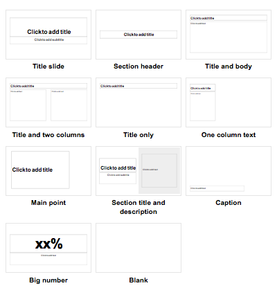
- Choose from the preset slide “layout” options when adding a new slide.
-
Use the preset title and content text boxes to keep your slides accessible for screen reader users.
- If needed, use simple slide animations (e.g., “appear” or “fade”) that don’t distract from the content.
- Present information using nugget or number lists with appropriate spacing between lines of text; and
- Avoid long paragraphs or “walls of text” on a slide.
Did You Know? Gill Sans, Arial and Verdana are the preferred fonts (or typography) for all YRDSB publications according to the Board’s Visual Identity Manual.
- Keep text large and consider how the audience will be viewing your slide deck (e.g., in-person vs. online or small vs. large group audiences).
- Use a consistent sans-serif font with clear upper and lower case characters.
- Use bold to emphasize important information; and
- Avoid the use of all caps, italics or underline for emphasis.
Did You Know? You can use a free online contrast checker to test the contrast ratios between colours. Text larger than size 18 can have lower contrast ratios.
- Ensure strong contrast ratios between text and background colours (use black and white as a best practice).
- Ensure all information conveyed with colour can also be understood without colour.
- Ensure the hyperlink text colour is clearly distinguishable from the body text colour.
- Add alternative text (alt text) to all images, tables, charts, diagrams and other graphics.
- Ensure any background images (placed behind text) do not affect the readability of text.
- Use the built-in “table” or “chart” tools when inserting tables or charts into a slide.
- Ensure any videos or audio content that are embedded into your slides have accurate captions (for videos) or transcripts (for audio clips) as alternative formats.
- Refer to the Accessible Content Core Skills for ways to make audio and video more accessible.
Did You Know? You can present Google Slides with automatic captions by allowing access to your computer’s microphone.
Acart Communications. (2017). Contrast Checker.
Google Help Center. (2020). Make your document or presentation more accessible.
Moran, K. (2016). Nielsen Norman Group. How Chunking Helps Content Processing.
Queen’s University. (n.d.). Accessibility Hub. Accessible PowerPoint Presentations Checklist.
Web Accessibility In Mind. (2019). WebAIM. PowerPoint Accessibility