Accessible Document Guidelines (PDF version)
Documents include any word processor software such as Google Docs, Microsoft Word or Apple Notes. Consider the following guidelines for creating more accessible documents so that people with and without disabilities can access and read your document in a meaningful way.
We have identified 5 key areas for creating accessible documents:
- Headings
- Fonts
- Alignment and Spacing
- Images and Graphics
- Links
A quick reference version of these guidelines are available as an Accessible Document Checklist.
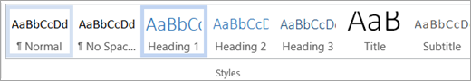
- Structure and format all documents using headings from the “styles” tools. The image below is an example of the Styles bar in Microsoft Word.
- Use or customize the preset styles to format and change the font size, colour and spacing of your headings and body text all at once.
- Keep heading levels in order (e.g., Heading 1, Heading 2, Heading 3, etc.).
Did You Know? Gill Sans, Arial and Verdana are the preferred fonts for all YRDSB publications according to the Board’s Visual Identity Manual. These are all sans-serif fonts which are easier for people to read.
- Use a consistent sans-serif font with clear upper and lower case characters.
- Keep text at or above a 12-point font size and use larger font sizes for headings.
- Use bold to emphasize text; and
- Avoid using all caps, italics or underline (hyperlinks excluded) for emphasis.
- Ensure strong contrast ratios between text and background colours (use black and white as a best practice).
One space after a period. As a best and modern practice, use only one space after a period, question mark or exclamation point. The use of two spaces to begin a new sentence is a dated practice that adds unnecessary spacing to a document.
- Align text to the left margin to keep even spacing between words. Avoid using justified text alignment which causes uneven spacing.
- Ensure appropriate spacing between lines of text (25-30% of the point as a best practice).
- Use built-in paragraph or line spacing tools to create both visual and non-visual space; and o Avoid using the space bar, ‘Tab’ or ‘Enter’ key repeatedly as it only creates visual space).
- Add alternative text (alt text) to all non-text content such as images, tables, charts, diagrams and other graphics.
- Always consider whether the addition of any image, graphic or other non-text content adds value to your document.
- Set the text wrapping of all non-text content as “in line with text”.
- Include a written summary of the information in tables and charts as an alternative format.
- Use the built-in table and chart tools and enable the “Repeat Header Rows” in Microsoft Word so that the top row of the table is repeated if the table spans multiple pages.
- Avoid adding text boxes into your document because the contents will not be accessible to people who use screen readers.
- Use descriptive and informative words or short phrases as anchor or link text (and avoid nondescript anchor text, such as “click here” or “learn more”).
- Check regularly to ensure there are no broken links in your document and that all hyperlinks lead to the intended location.
Acart Communications. (2017). Contrast Checker.
City of Peterborough. (2018, December). Guide to Accessible Documents.
Google Help Center. (2020). Make your document or presentation more accessible.
Harvard University. (2020). Digital Accessibility. Design for readability.
Queen’s University. (n.d.) Accessibility Hub. Accessible Word Document Checklist.
University of Minnesota. (2020). Accessible U. Start with the 7 Core Skills.